

I tried so many new things. Half of the kites were quilted in patterns I had never tried before. The rest were variations of stuff I've done on other quilts. I did some McTavishing, several patterns I've admired on The Inbox Jaunt and a few designs I found while googling "freemotion quilting." I quilted three or four kites with what I call an Easter egg pattern because that's what the finished area looks like.
First time with feathers - and it looks good! It took two attempts. I ran the spine along one side of the kite the first time, which made for very long feather loops. They were terribly wobbly and I ripped them out. Then I put the spine down the middle; the shorter feathers were easier to deal with. I am improving at quilting back over a line I've already stitched. Which is probably why I haven't attempted feathers until now. Being able to accurately stitch over stitching makes my pebbles look better, too.
 I struggled doodling some of these designs. My pen and paper versions are smoother than my quilted version, especially if I'm filling an area. So if my drawings are cockeyed, the quilted version is going to look worse. I felt like I botched one or two kites, but when I stepped back to look I thought: hey, that's pretty cool.
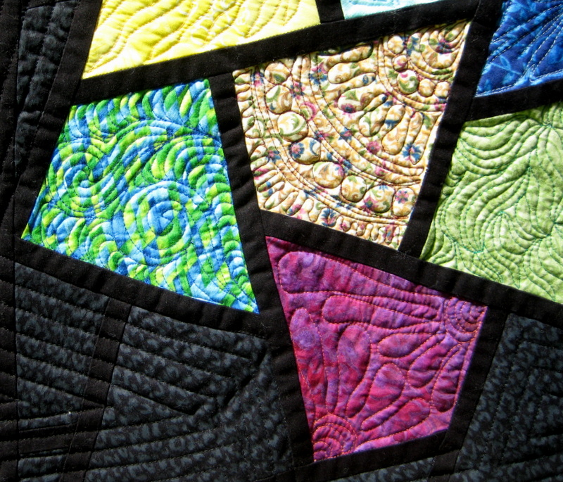 |
| Favorite kite: the blue-green swirls |
A handful of kites contained the dreaded pebbles. They take such concentration, but let's face it - pebbled quilts look great. I find that a string of them is easier than random fill. A few kites had what I think of as a ripple or crescent moon fill. I love how that looks and it was easier to do than I anticipated. I'll be doing more of that!

At first I was conservative with thread color and contrast. I wanted the quilting to be seen, but still match the kite's fabric. I disregarded that plan when I found out how good salmon pink and orange creamsicle looked on some yellow, white and brown material. I ripped out only one kite due to a bad color combination and went with a lower contrast. Lesson learned: I'll will be auditioning thread even if I think it has no business with the background fabric.

I was going to bind the quilt in black to draw focus solely to the kites. As it lay on the floor I decided it needed a narrow band of color around the edge. So I bound it with a scrappy flange binding. I ran into issues with that, including running the colors in the opposite direction than I intended and misjudging how long each color should be (my start/end point has shorter strips than the rest). Happily, it works great with the quilt and my "mistakes" don't jump out at me (so I know no one else will see it). That's a win all around!
Just as I finished pinning the binding to the front, I realized I was missing the corner pockets and loops for hanging. Ack! I carefully ripped out and restitch the corner binding and a bit on two of the edges. The quilt is intended to be hung vertically, but it has hooks on one side to allow hanging as a landscape if that's a better fit for the wall.
This was a fun learning project. I can't wait to apply what I learned to my next quilt!
Gorgeous Sally!!!!
ReplyDeleteWow! Wow! Wow! What more can I say? It's gorgeous, front and back!
ReplyDeleteThis is just lovely! So much patience to be able to do all those different designs. Overall the quilt is just beautiful too. Love the colors. It really looks like stained glass!
ReplyDeleteWow, Sally, this is beautiful. I like how you've used a mix of bright and pastel fabrics with some larger floral designs, and some low volume and how you incorporated more kites in the back. And then your adventurous quilting is just perfect! Well done!
ReplyDeleteLove your kites!
ReplyDeleteWow - just beautiful!
ReplyDeletestunning. The quilting is terrific!
ReplyDeleteLovely!
ReplyDeleteSo beautiful! The colors are fabulous and the backing! Wow! It really sets off your quilting skills! Nice!
ReplyDelete