
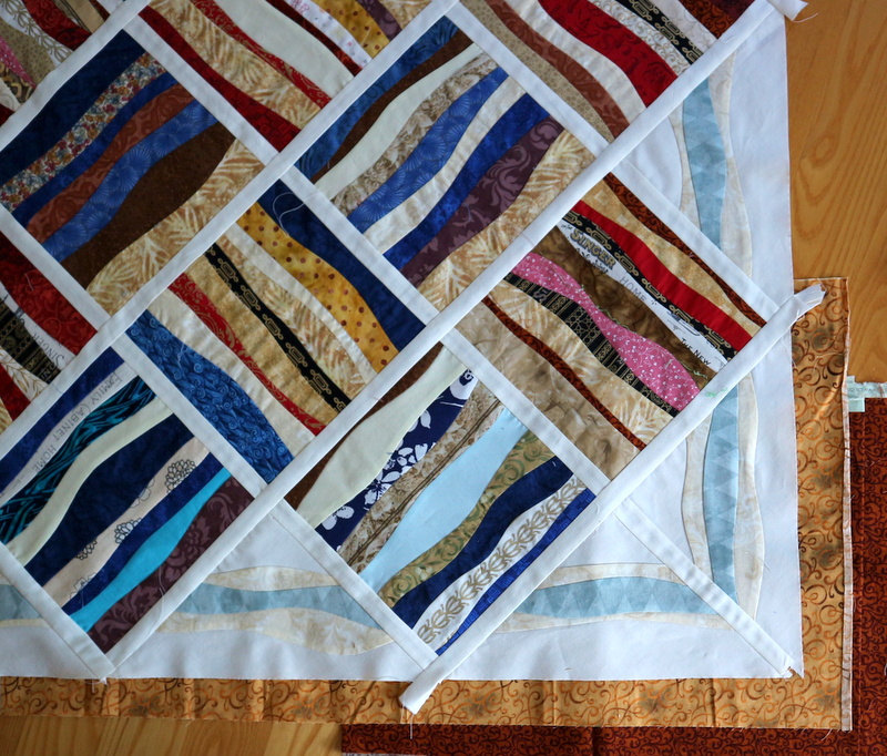
It needs a border. Or a wide contrasting-color binding. But I'm not convinced a wide binding would work with what I have in mind. I dug through my limited stash and auditioned a dozen different fabrics of reds, golds, browns, blues and even greens. It's funny how some fabrics just yell Nope! and other's keep you guessing. The edges immediately rejected any cool color. It wanted warmth. I keep returning to a reddish-brown gold and dark rust.

If I run with my existing gold, then binding in the dark rust looks good. I also found some grey stone print. Binding a quilt named Creekbed in pebbles seems fitting. There's a fair amount of blue in that grey, too, that goes with the blue in the quilt.
Decisions, decisions.
Wow I like this Sally! I came here for Thankful Thursday but this grabbed my attention! Makes me think of Karla Alexander's Stack a New Deck quilts. Fun fun!
ReplyDeleteLove the wavy lines in your blocks!!!
ReplyDeleteI always enjoy following yor decision making process! I like how that blue pulls out the blues in your blocks.
ReplyDeleteLooks Fantastic Sally!
ReplyDeleteI find your work amazing. I do, though understand, the balancing act you're doing in relation to the border. I do like the 2 inch border, though I might have gone with a light to medium grey to make the gray wavy lines in the blocks set on point pop and while the white stays in place as the background area embraces the blocks. Much like how distances in the background embrace mountains. But as that color is not in your stash, the gold will work, even though from my perspective, it drags my eyes away from the middle of the quilt/flimsy. As always your creations energize my mind.
ReplyDelete